Center for Art & Design Map
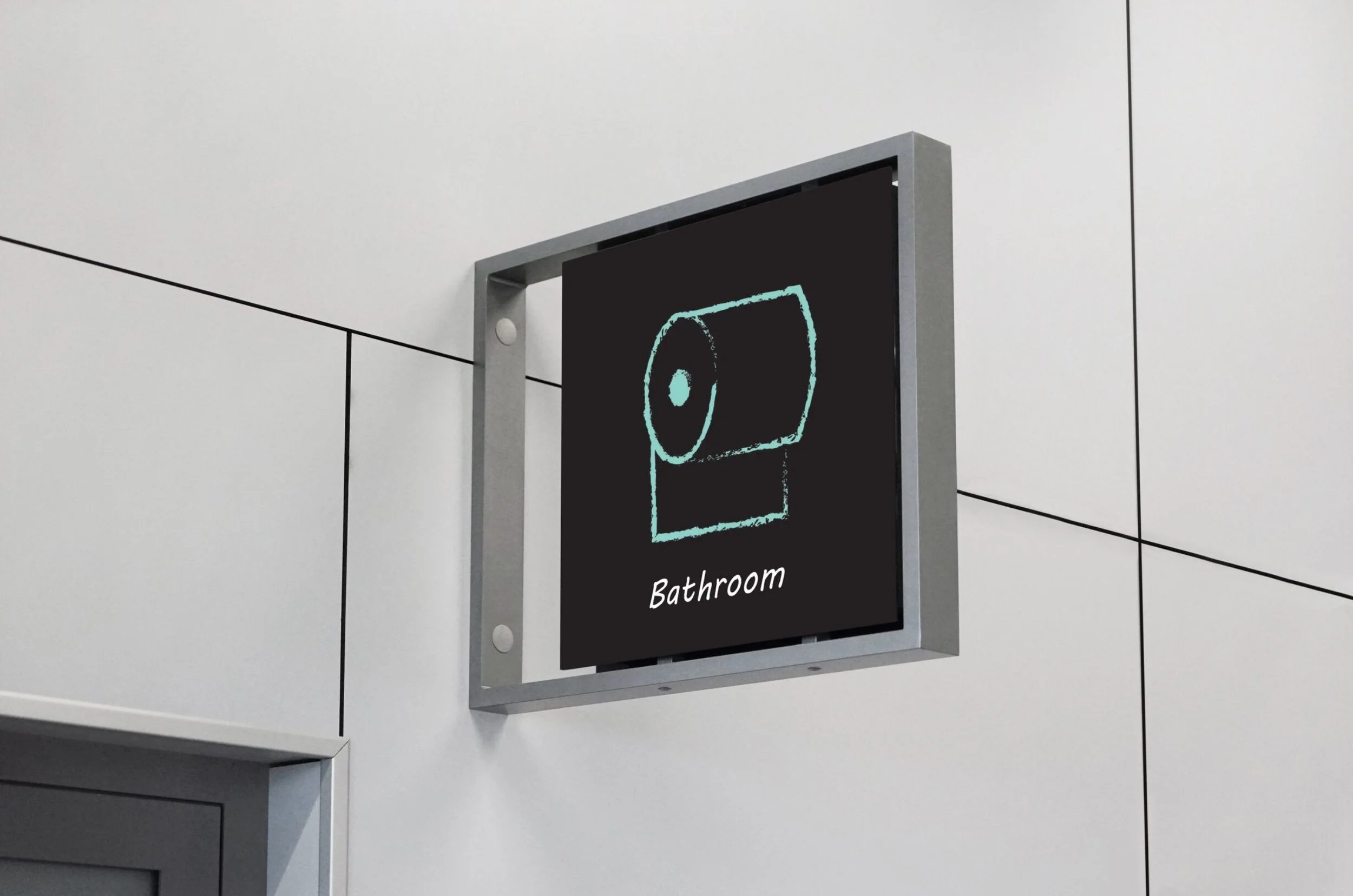
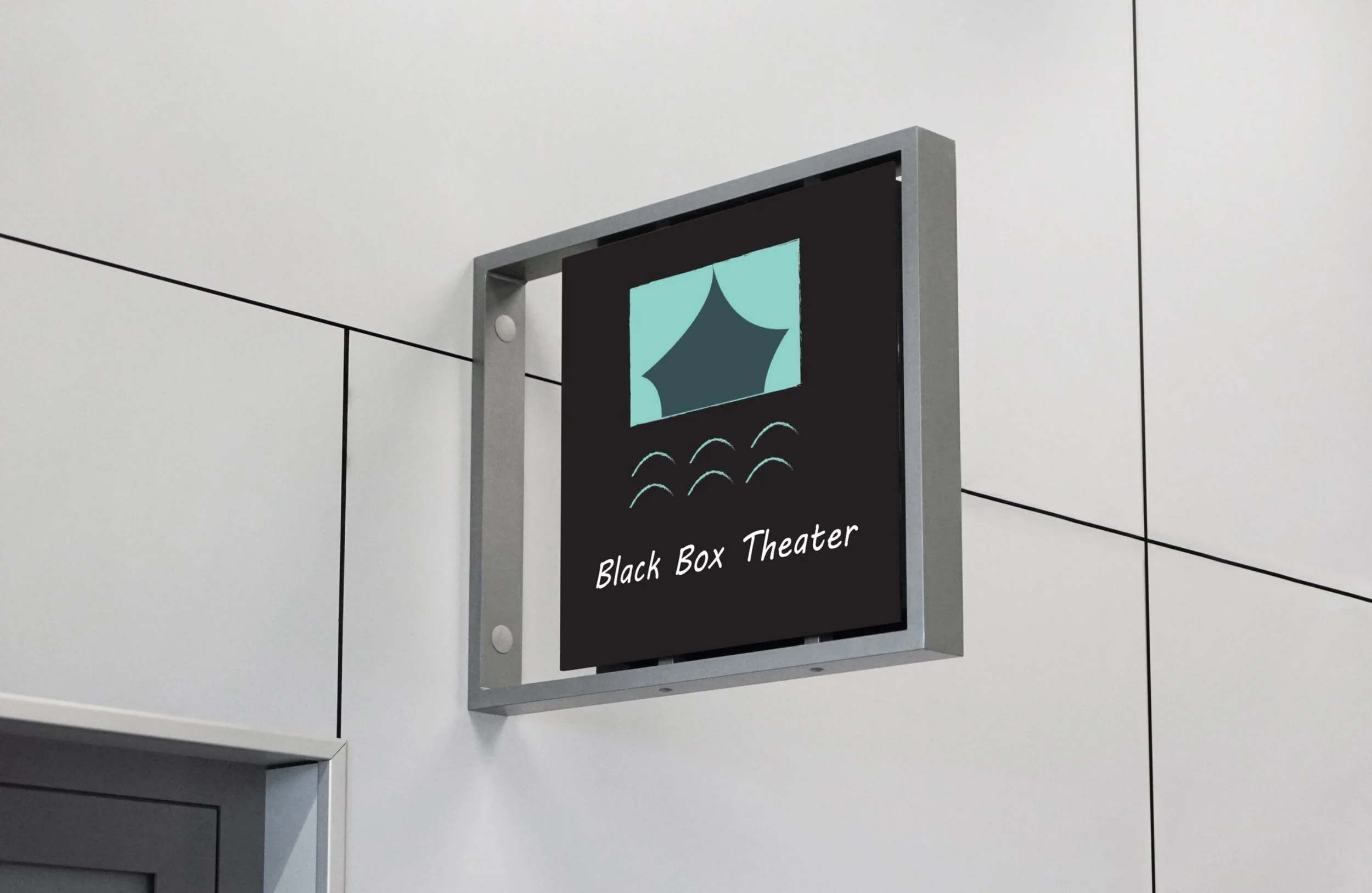
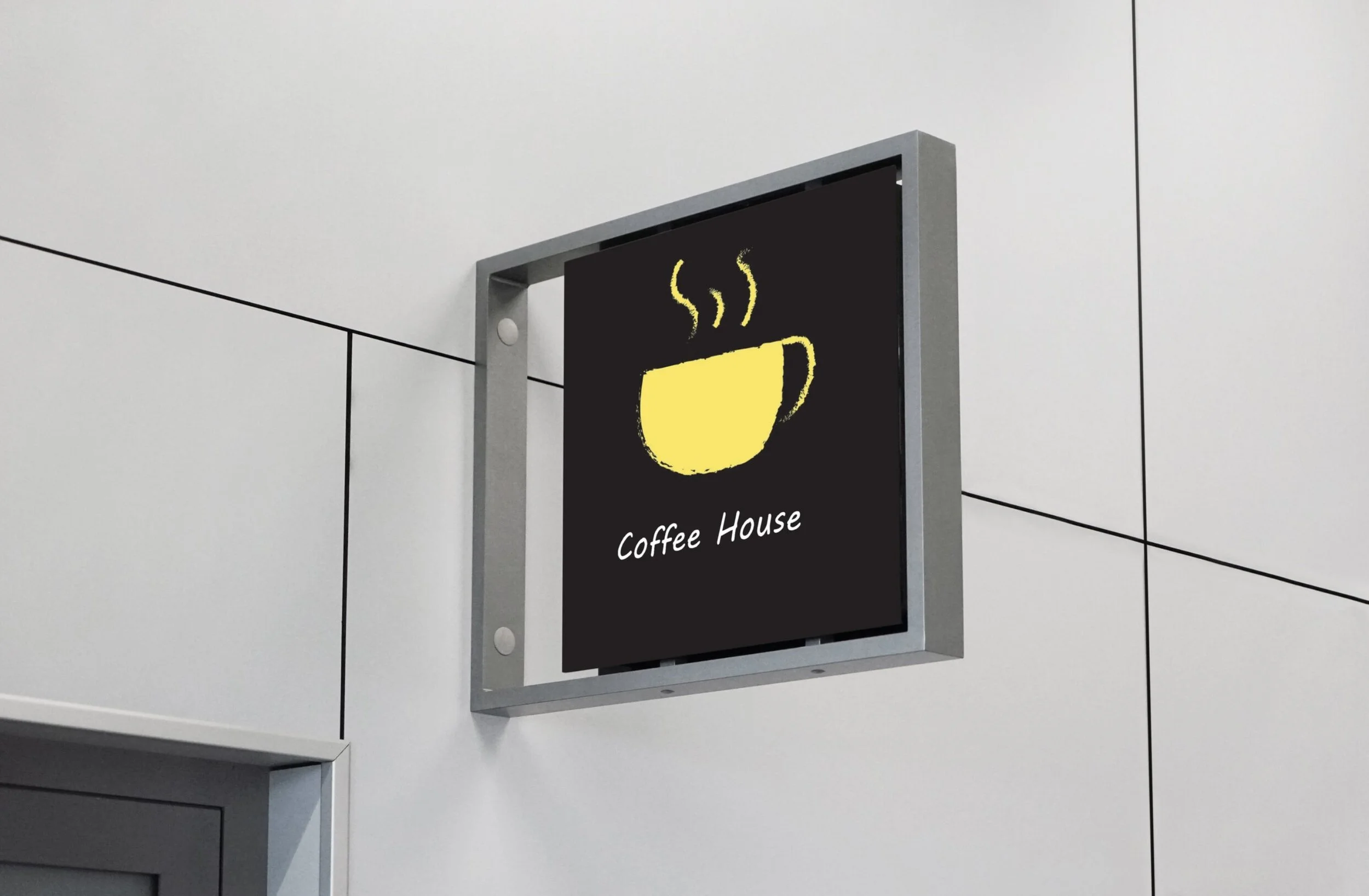
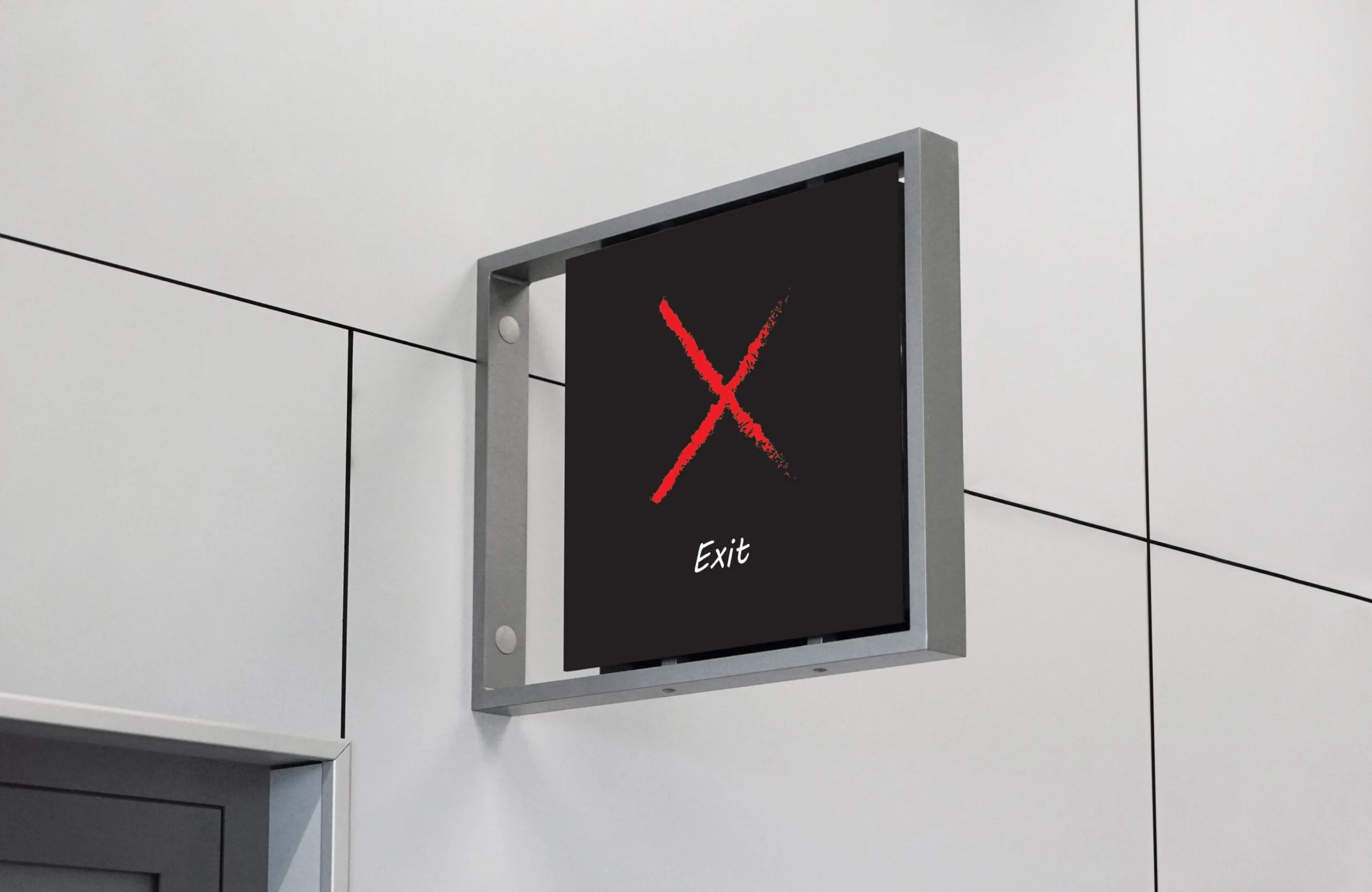
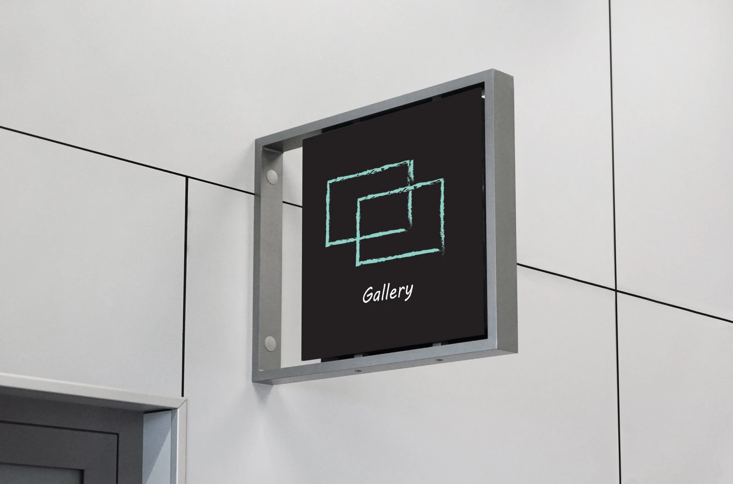
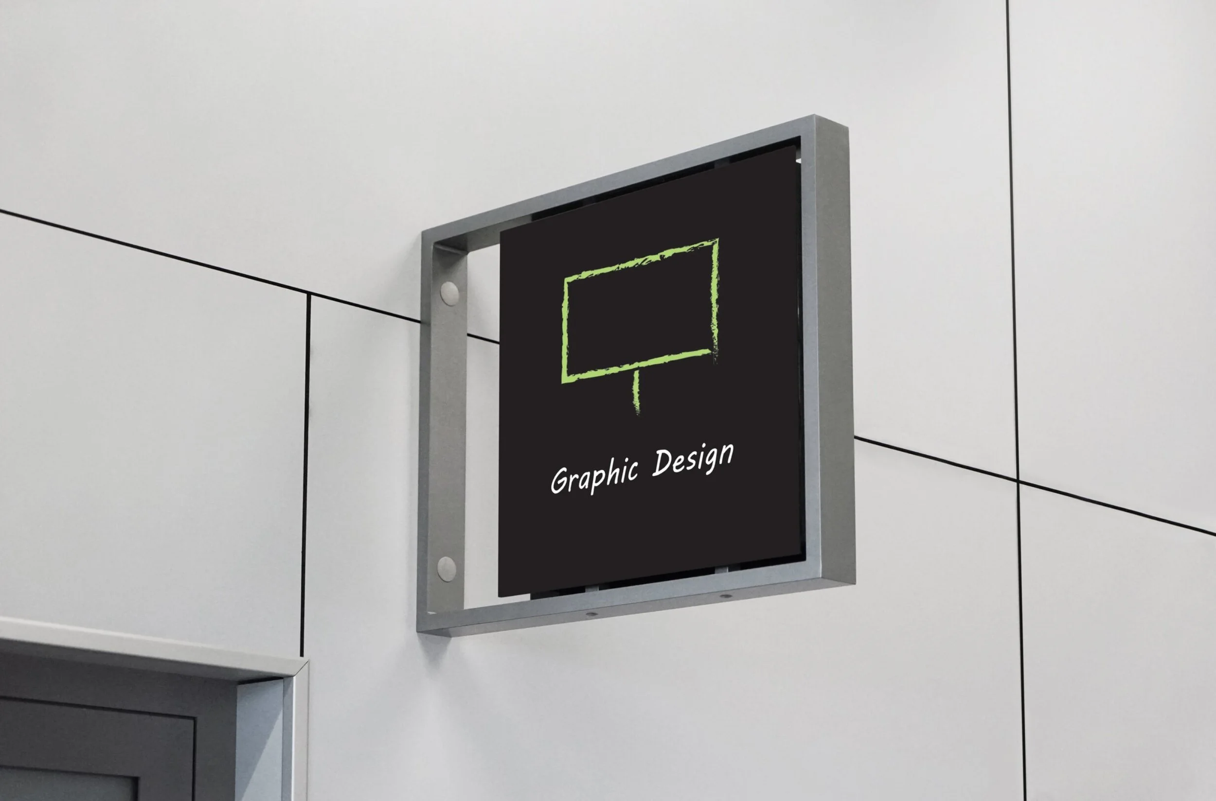
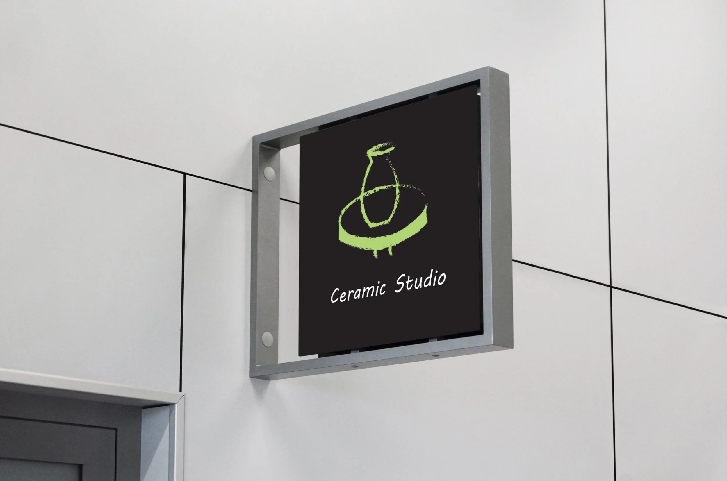
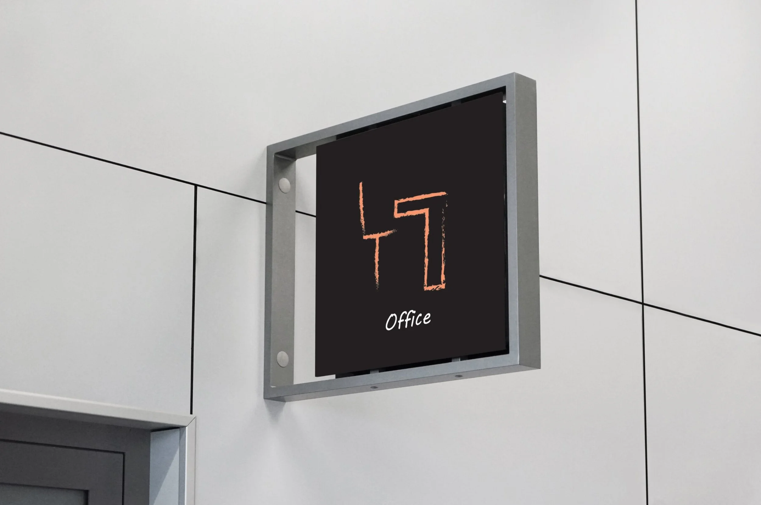
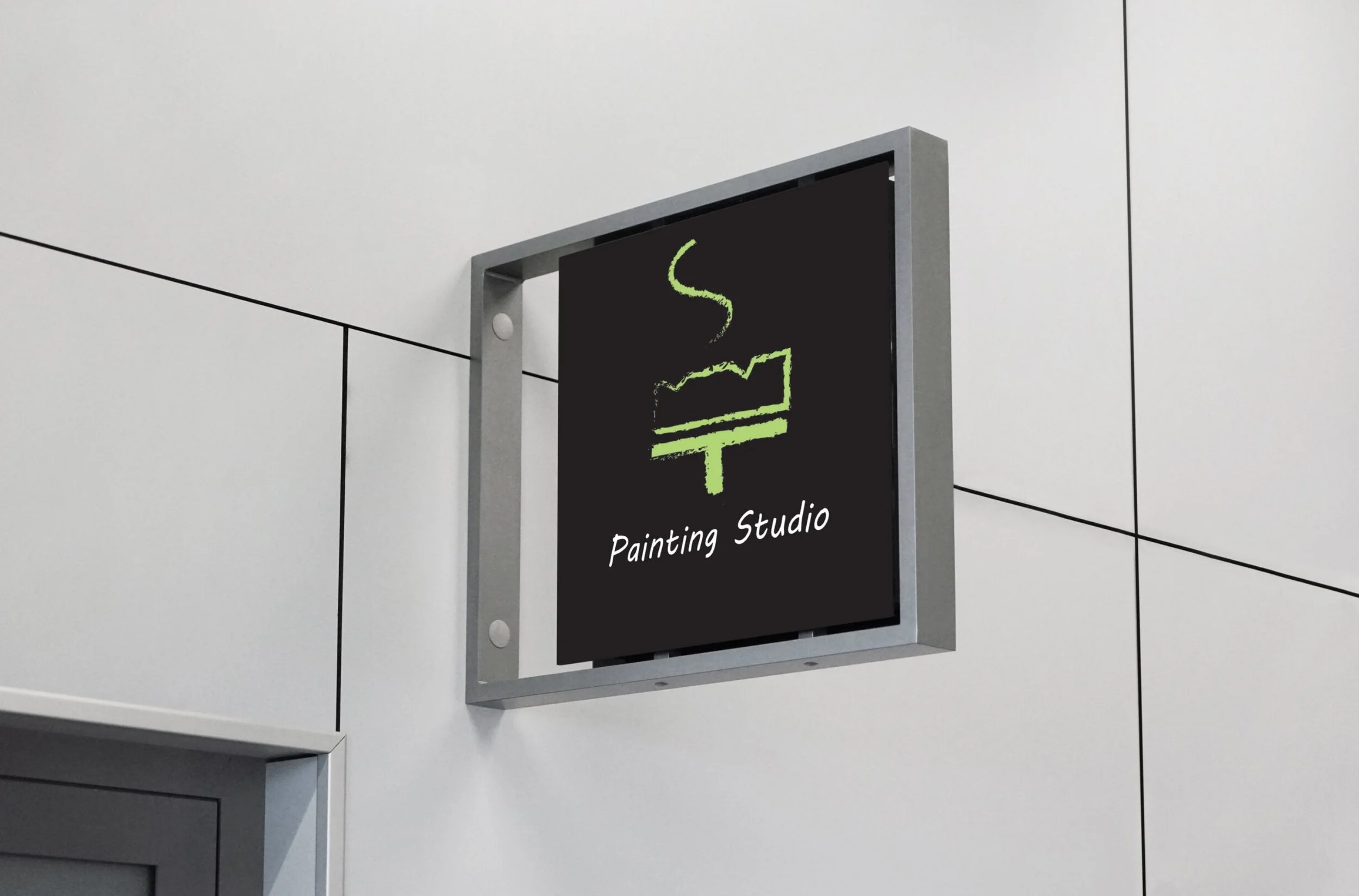
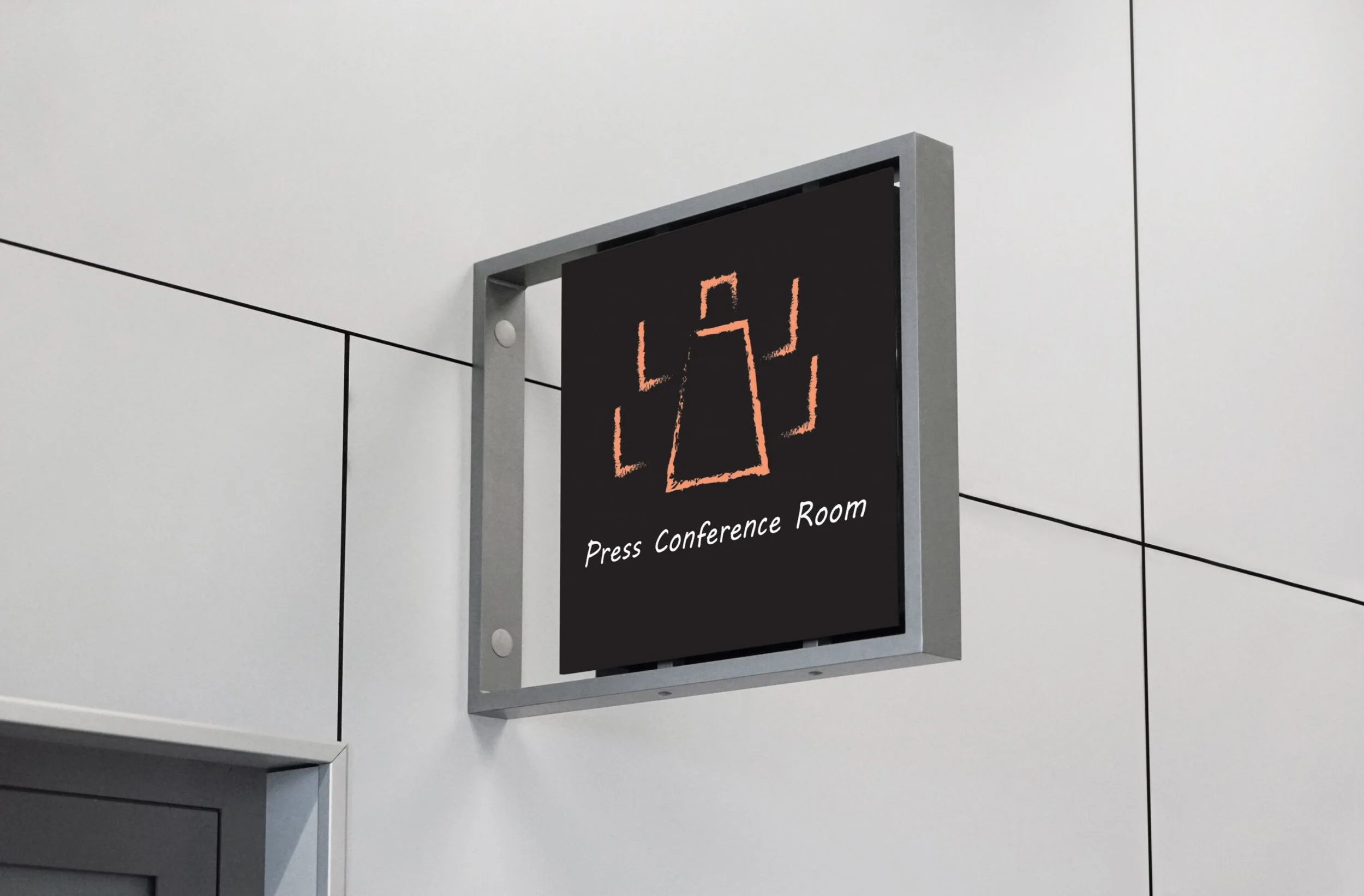
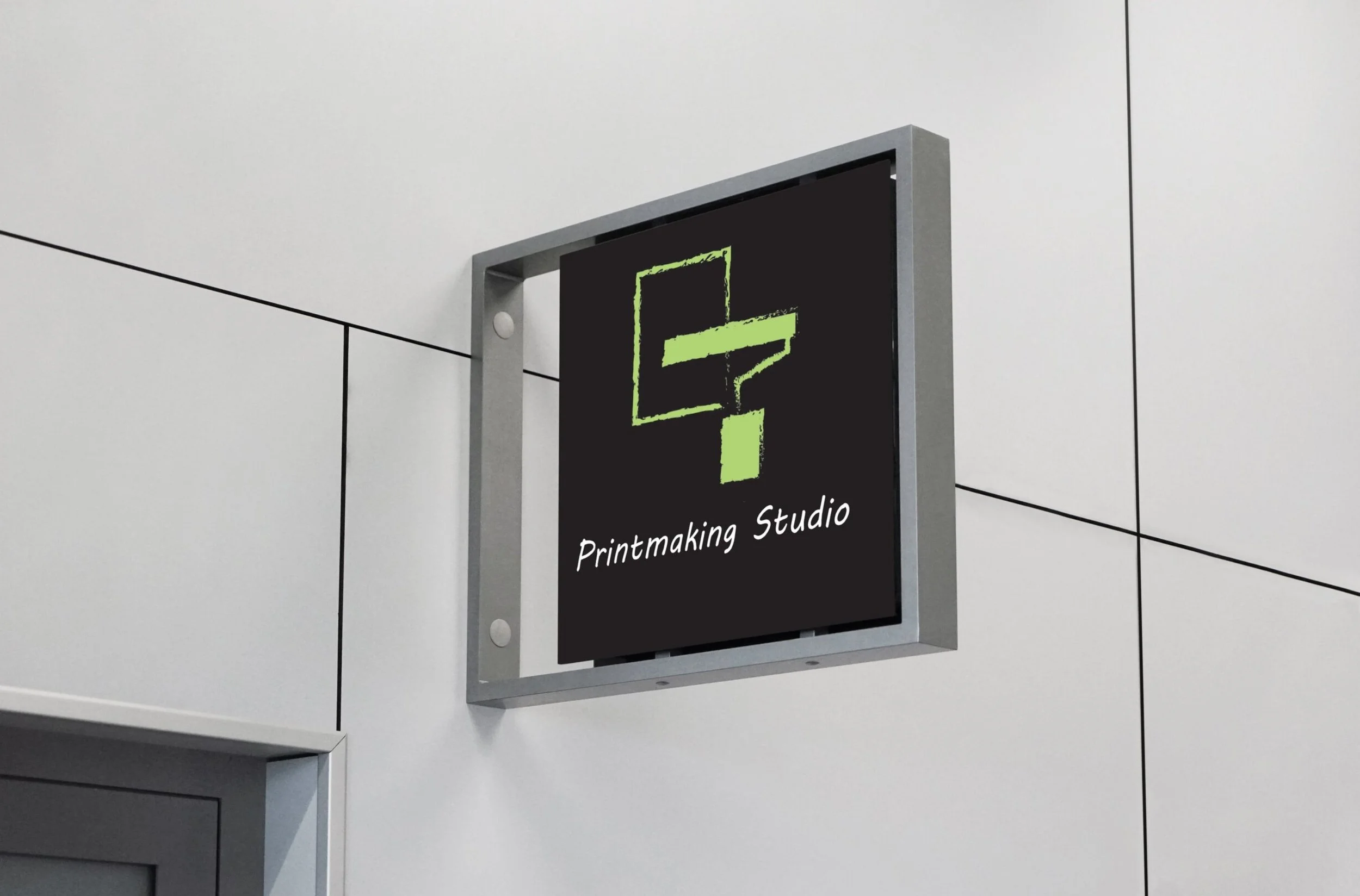
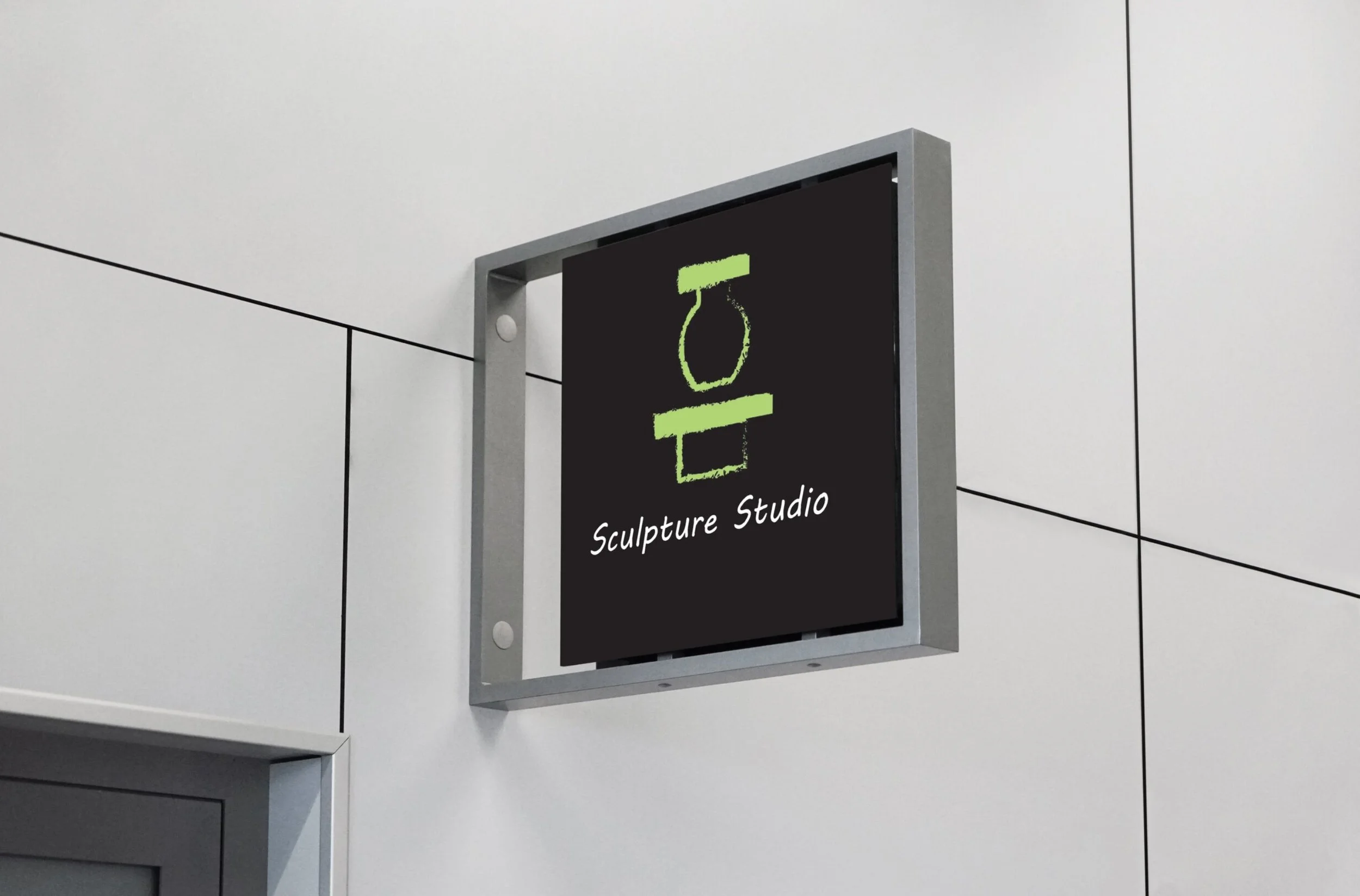
The goal was to design a cohesive signage system by applying core design principles — typography, contrast, grids, and color — to create visuals that are both functional and visually unified."
The process began with independent research into infographics — an approach I enjoy and felt would be more engaging than a traditional map. However, after exploring the format, it became clear the layout wasn't working. Text and hallway paths competed for space, leaving little room to breathe. From there, the focus shifted to experimenting with Illustrator's brush library to find a style that felt right. A charcoal feather brush stood out as the perfect fit, giving the map a hand-crafted, textured quality.Iconography was introduced to improve readability and reduce visual clutter, giving each element more room to stand out. The map outline and text were refined to white, replacing the charcoal feather brush strokes with clean, straight lines for a more uniform and polished look. A new font was chosen to complement the energy of the icons and keep the design from feeling flat. The result is a map that feels inviting — one that naturally draws the audience in and encourages them to use it